
An Accessible Online House
- Antonio Da Veiga Rocha

- Jan 28, 2021
- 3 min read
Updated: Mar 21, 2023

There is plenty of information out there as to how accessibility guidelines work, and how social workspaces can attend to such needs. Sometimes what limits having this information on hand and its awareness is the lack of resources; but only sometimes! It's true that if I am a small company it may be hard for me to bring-in the information needed, or the materials I want, to make my worksite, work product, or work goals, accessible to my work groups and/or the wider public. Still, being accessible should not be overlooked by any institution, as it is one of the first signals of interest you show any work member or client.
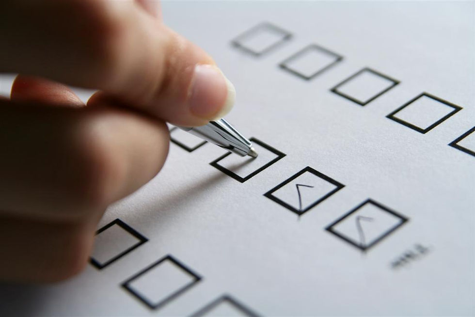
Here at KSCC we always recommend hiring someone to do an accessibility audit of your organization, it's usually the best and most efficient way to start, and it is something we do quite well. But a more self-initiated step can be achieved by simply imagining your circumstances differently and moving through your social spaces unlike you would normally do. This requires you to put on some Empathy Glasses which will help you identify some accessibility gaps you may have. This is not only good business, it's smart business.
Community Accessibility
When my parents first came to the United States, they couldn’t speak the language and had to rely on a community of Cape Verdeans to point everything out to them. This was anything from where the Social Security Office was to where their local elementary school was. They often took with them someone who understood the language, the landscape, and elements of the culture. Often immigrants themselves such individuals were not paid for their services, it was somewhat part of the collective immigrant responsibility. They were someone’s son or daughter, someone’s wife or husband, or friend. When no such individuals were available my parents had to go on their own, hoping that whatever establishment they were visiting attended to their needs without judgement. Such public institutions have learned that this too is their responsibility and now have multiple translation assistances, diverse follow up procedures, and a variety of communication processes.

Design in Function of Access
Earlier this week I read Lilly Smiths’ article on the White House’s new website and made me think of accessibility as duty. She mentions the transitional change between the former administrations website design and the current administration’s, writing about accessibility now versus the limited accessibility then. For one, in the previous administration’s website the Spanish version was removed, yet 'according to Census data 13% of the US population are Native Spanish speakers with another nearly 12 million bilingual Spanish speakers. This makes the US the second largest Spanish speaking country in the world, ahead of Spain itself'. (source) This removal was clearly a one-sided populist move, but more damaging is that it communicated that accessibility for many was not an important concern in the highest public house.
Smiths writes about the marriage of access and design in the new site. She comments that www.whitehouse.gov now does a seamless job of information-portal and information-accessibility, and, having toured it myself, I agree. Where previously inconsiderations were evident from font sizes to negative spaces, now there are clear fonts, friendly coloring, easy navigational indexes, and, of course, a Spanish version (accessibility for the millions of Spanish speaking Americans), there is also a pronoun option in the white house contact form. This is to name just a few of the changes; this is design in function of access.
Of course, all of this is due to companies that dedicated themselves to designing for access like Wide Eye and 10Up, the companies behind the website remake. In Wide Eye's ‘About’ page they strongly communicate and display their diverse make up and stay true to their word on simplicity and accessibility. Their home page is spacious, with large fonts, and convincing color contrasts. Their staff profile pictures are large, clear, and their titles easy to navigate. Visual communication is strongly considered, taking into account the wide range of possible website visitors. It’s true, this is their specialty, but who better to learn from than those that are at the forefront of such visual concerns.
Feeling Welcomed, Feeling a Part of.

The feeling of Feeling Welcomed is almost comparable to no other feeling. It is something many of us can recall responding to positively. It leaves us feeling considered and valued, and it reminds us of how we should act towards others. By such conducts we signal to others our intentions, our hopes, and our wishes. Though those individuals that helped my parents long ago weren’t monetarily compensated, they were always invited to our home, always afforded a warm meal upon their visit, and always, always, made to feel welcomed.


Comments